Authentikka Mitte
Hospitality interior architecture
520 qm | Hamburg | 2024
Conception, Preliminary Planning, Design Planning, Built-in Furniture Design, Furniture Selection, Lighting Selection, Budgeting, Detailed Planning, Tender & Procurement, Artistic Site Supervision
Partner
Kvadrat, Dedar, Camira, &tradition, Modular Lighting, Oi Soi Oi, Ferm Living, Forbo Linoleum, Hübsch Interior, Designers Guild, Nobilis, Flos, Nordic Knots, Santa & Cole, Hay
Photography
Daniel Farò
» The use of strong colors creates characterful spaces that stand out from each other and harmonize with each other in the overall concept. «
With the aim of bringing authentic Indian cuisine to Hamburg, Tarun and Sonja opened the third Authentikka restaurant in Hamburg, nearby the Central Station. The owner couple wanted another restaurant that was modern and at the same time reflected the craftsmanship, nostalgia and traditions of their home country of India – hence the “Modern Indian Nostalgia” concept created by Studio Lineatur.
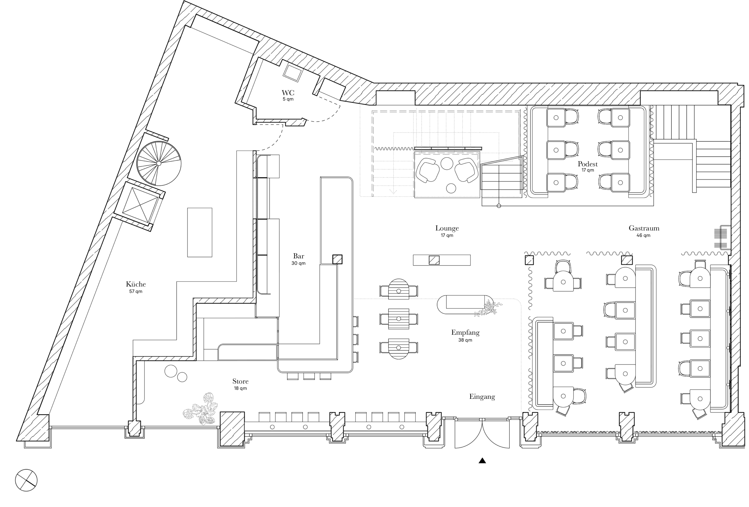
Spread over 520 square meters on two floors, the new location in the heart of Hamburg offers space for around 200 guests. As in Authentikka in Winterhude, the focus here is on differently designed but harmoniously coordinated concept worlds. A traditional, authentic world with materials that develop a natural patina and another world that appears light, dynamic and lively.
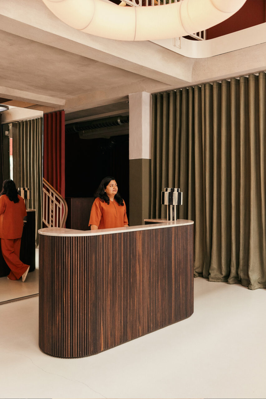
The reception, bar, main dining room and lounge are located on the first floor. The two-storey entrance area, with the spectacular paper lights in the air space and the reception counter made of dark corrugated wood and natural stone, is complemented by a mirror cube, which zones the spacious first floor and reflects the different colors and elements in the room.
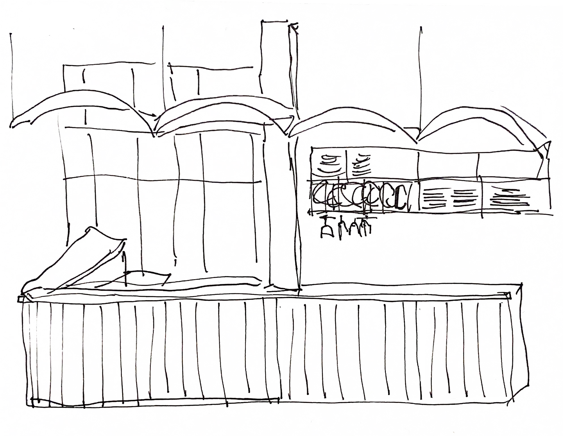
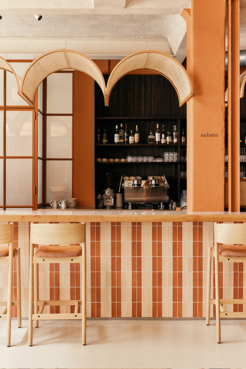
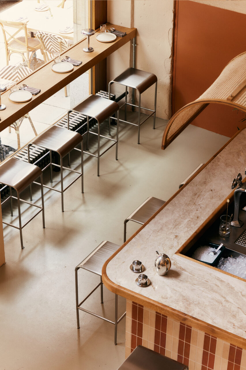
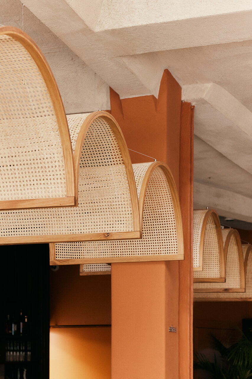
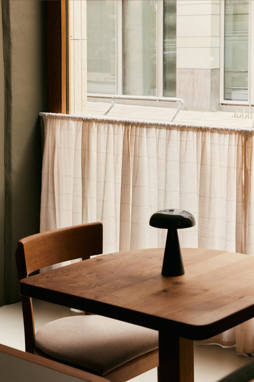
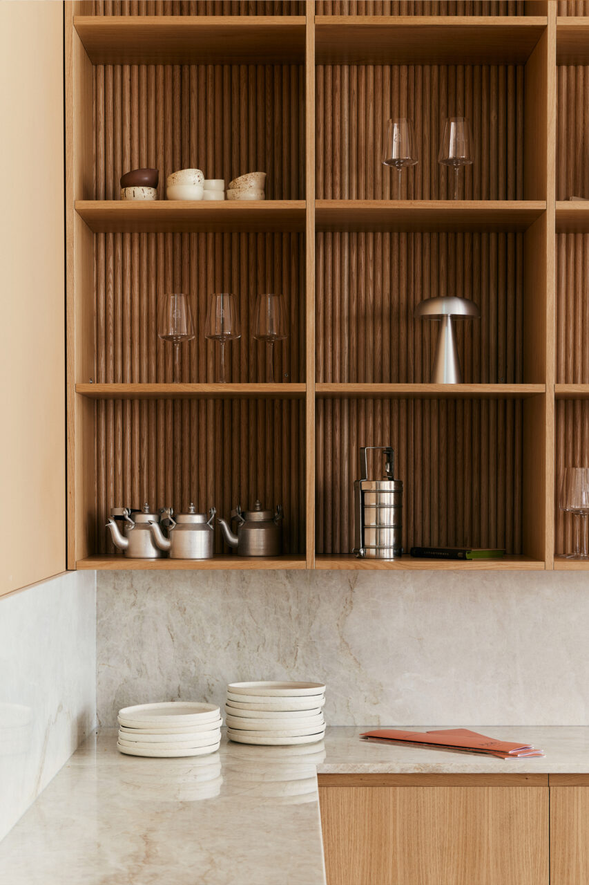
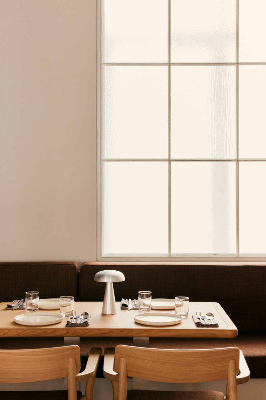
The spacious bar is a real eye-catcher with striking striped tiles in the colors “Pappadam” and “Bindi”, a Taj Mahal natural stone top framed in recycled oak wood, as well as rattan arches and a back shelf made of dark corrugated wood. Fresh accents are provided by stainless steel details in the seating area by the windows.
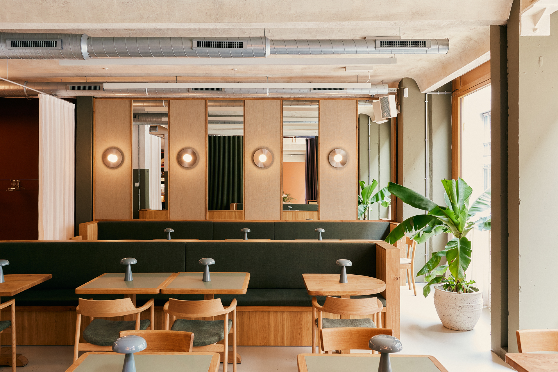
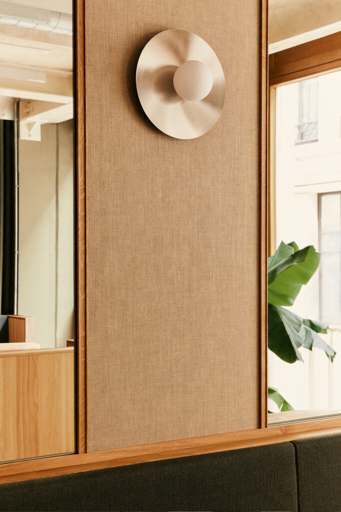
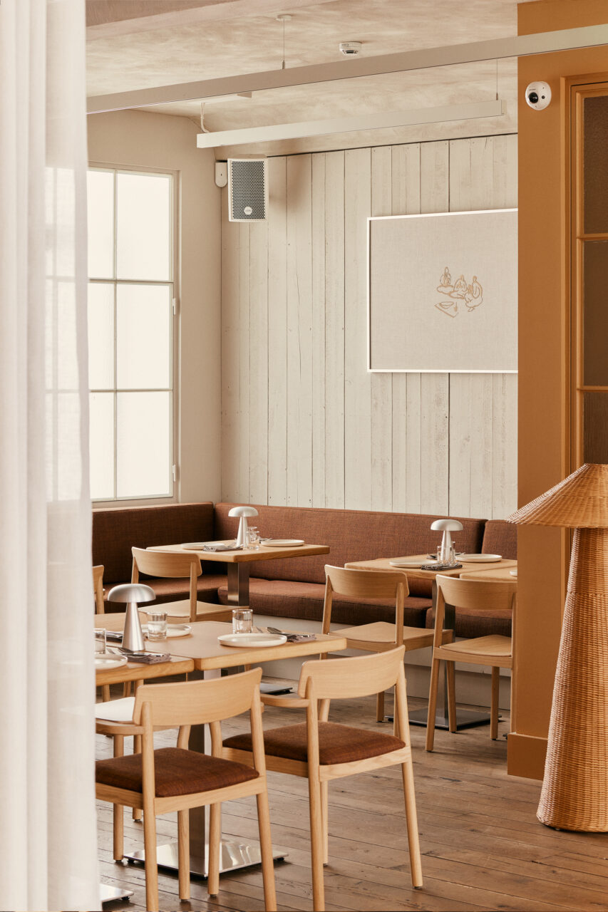
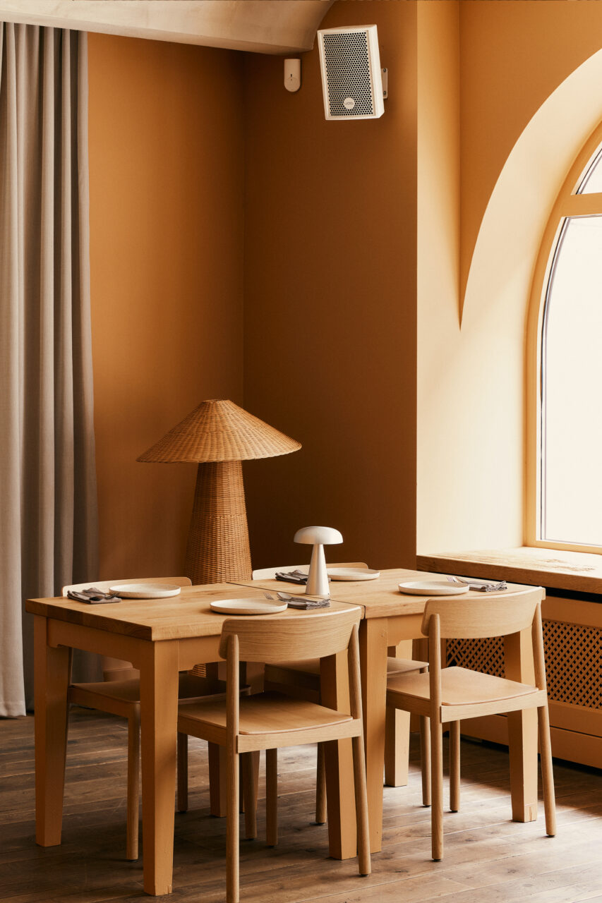
The main dining area in the colors “Okra Green” and “Cardamom”. The back wall is fitted with mirrors, the reflection of which enhances the vibrancy and dissolves spatial boundaries. The covered jute paneling in the profiled wooden frames and the stainless steel wall lights in turn create an exciting interlocking of the concept worlds.
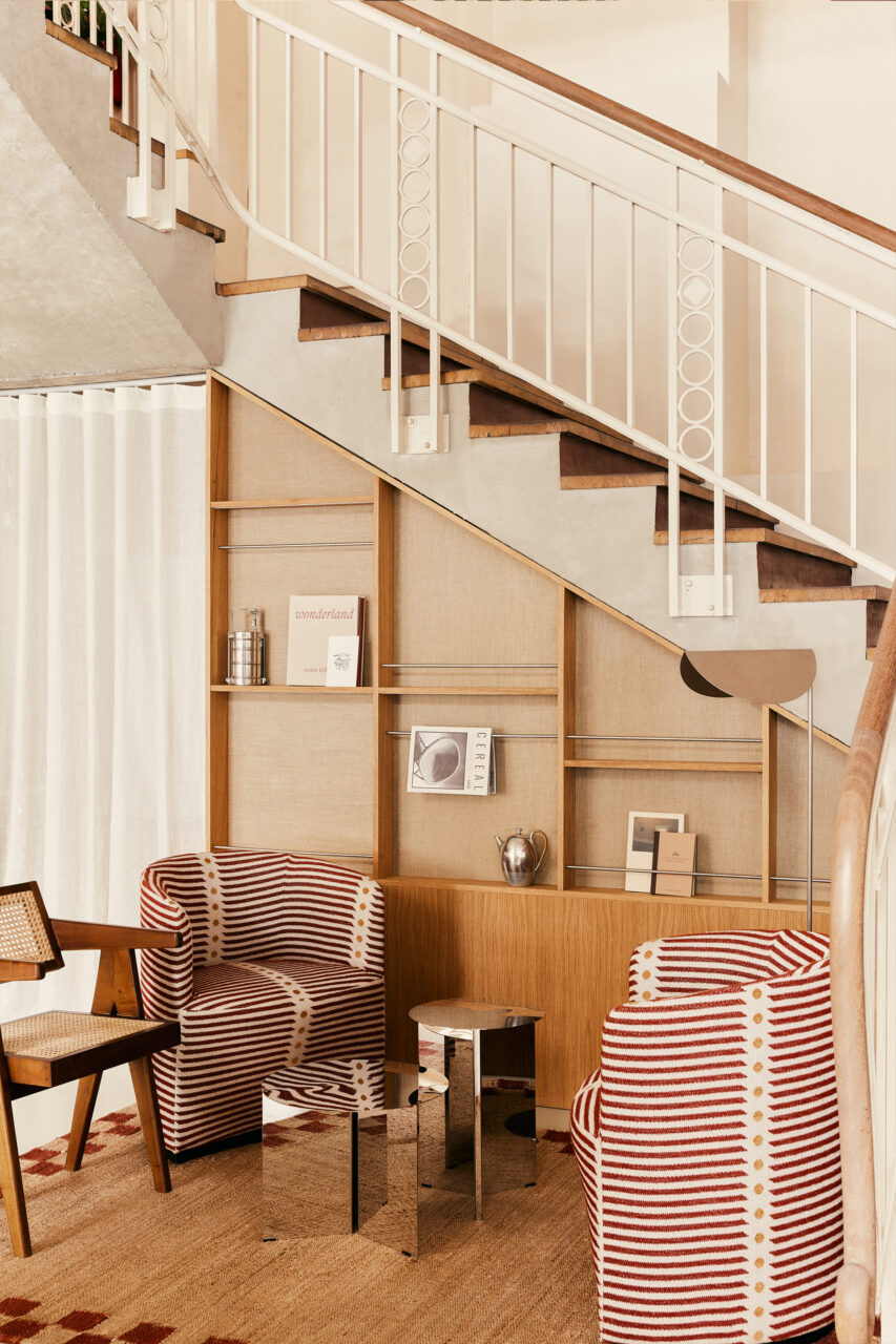
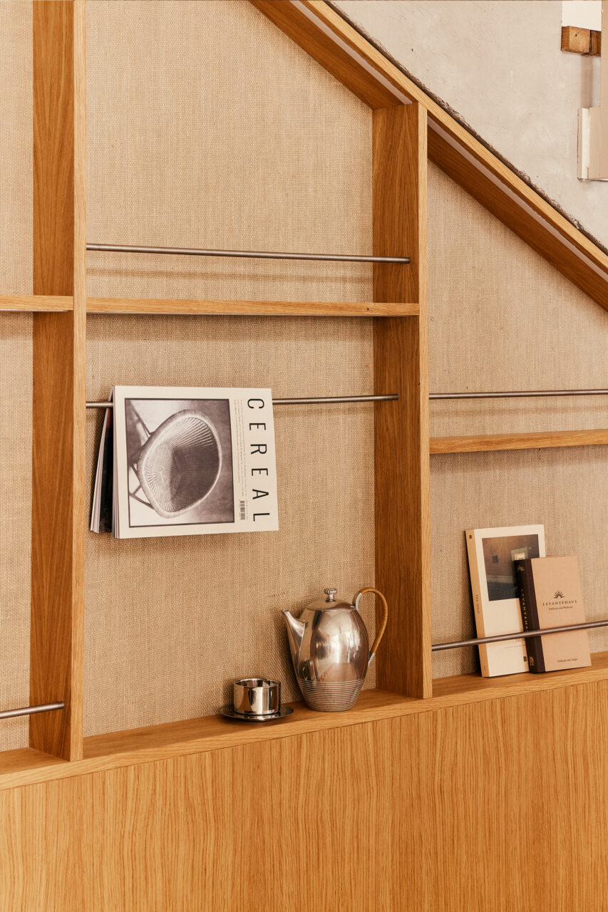
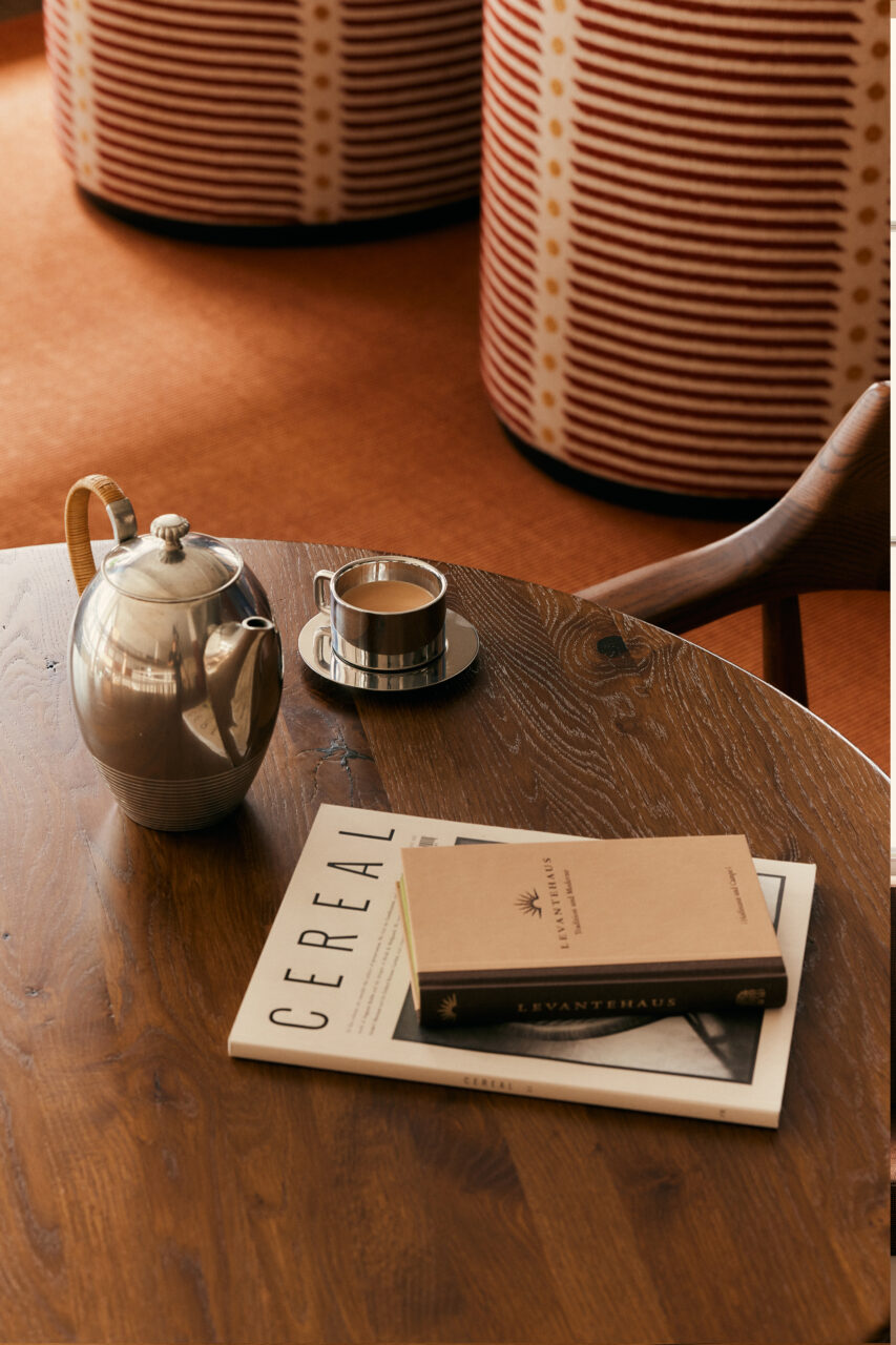
Behind the mirrorcube is a seating lounge where guests can relax and wait for their seat. This includes a curated shelf displaying authentic Indian magazines and books. The mix of tactile elements such as fabric, jute and rattan combined with stainless steel and playful patterns creates a particularly impressive “Modern Indian Nostalgia” look at the transition to the upper floor.
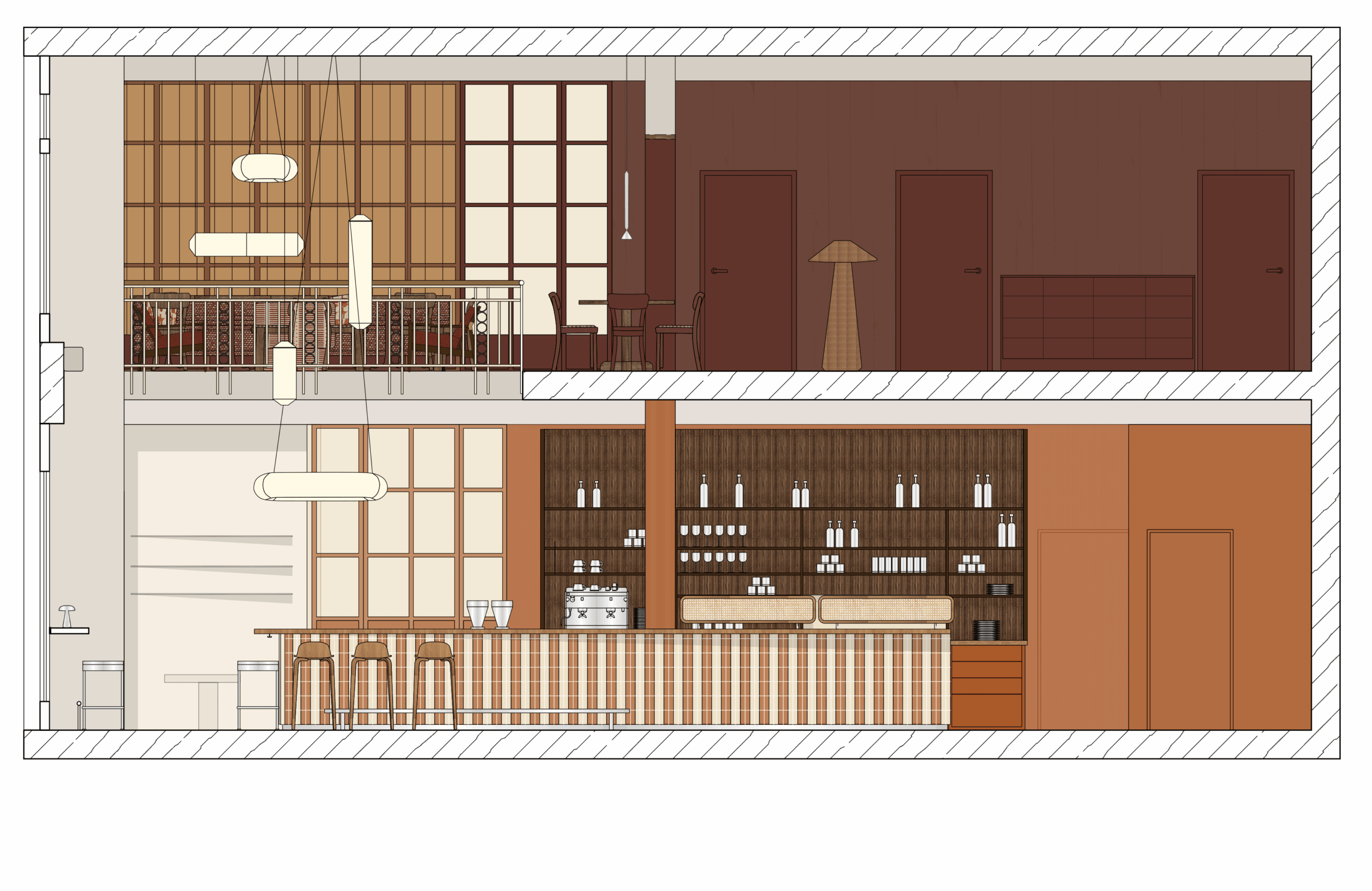
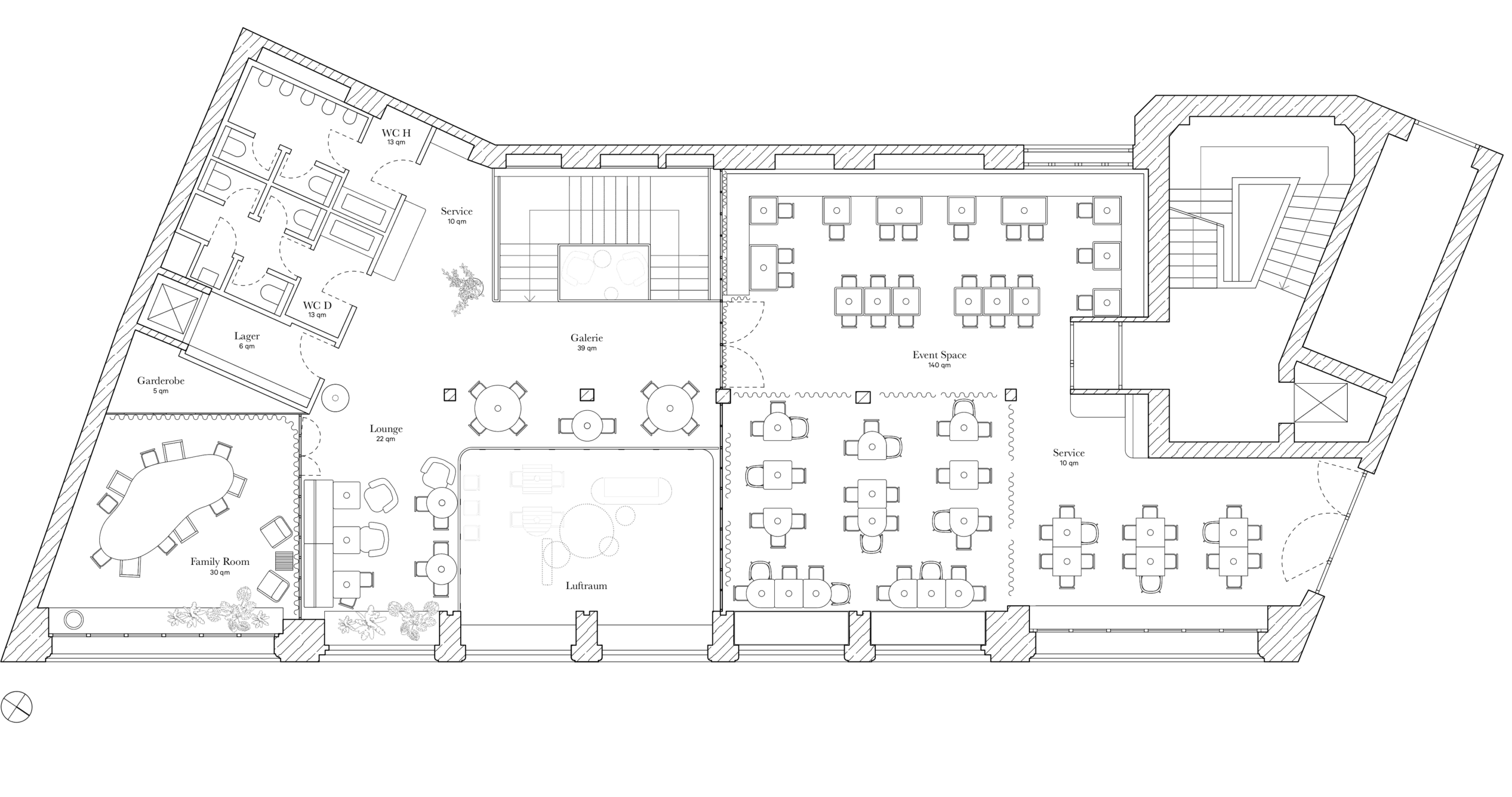
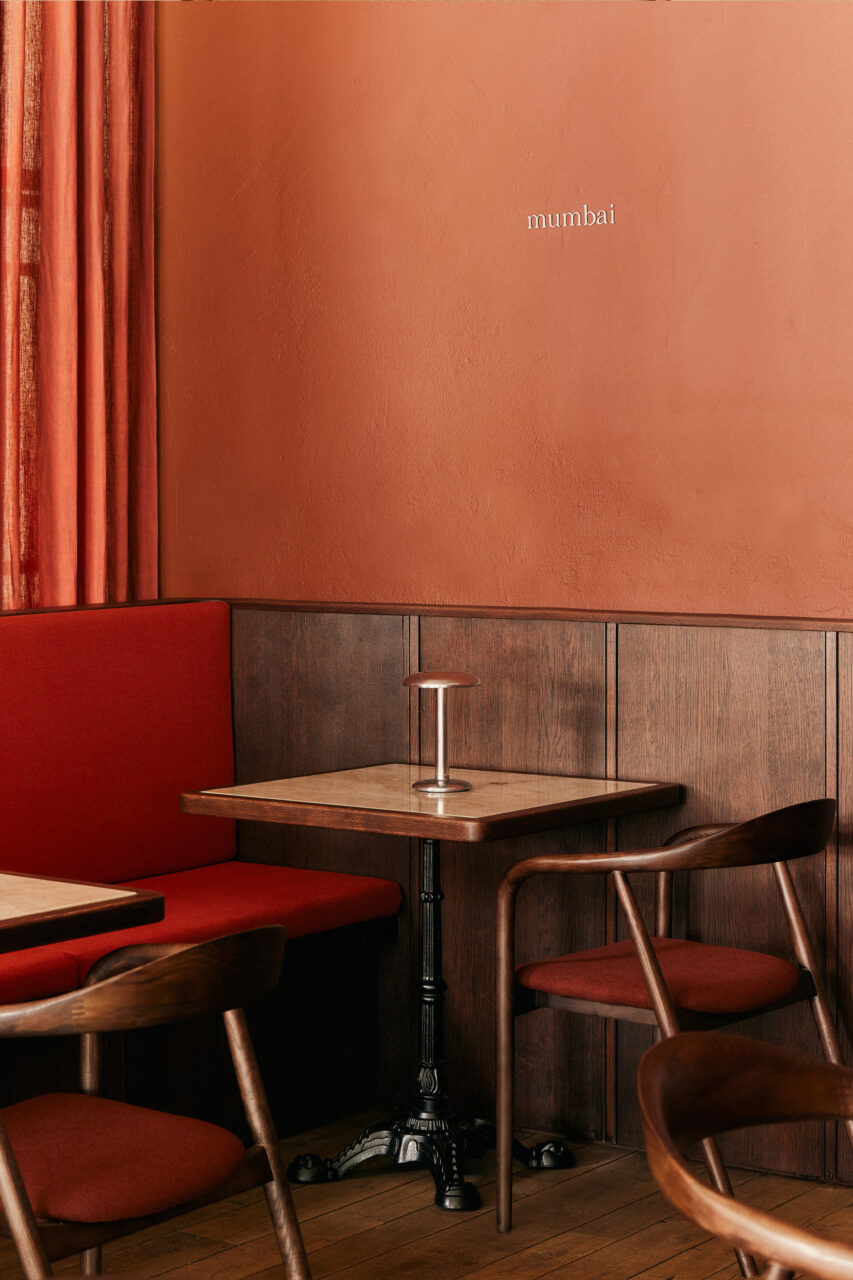
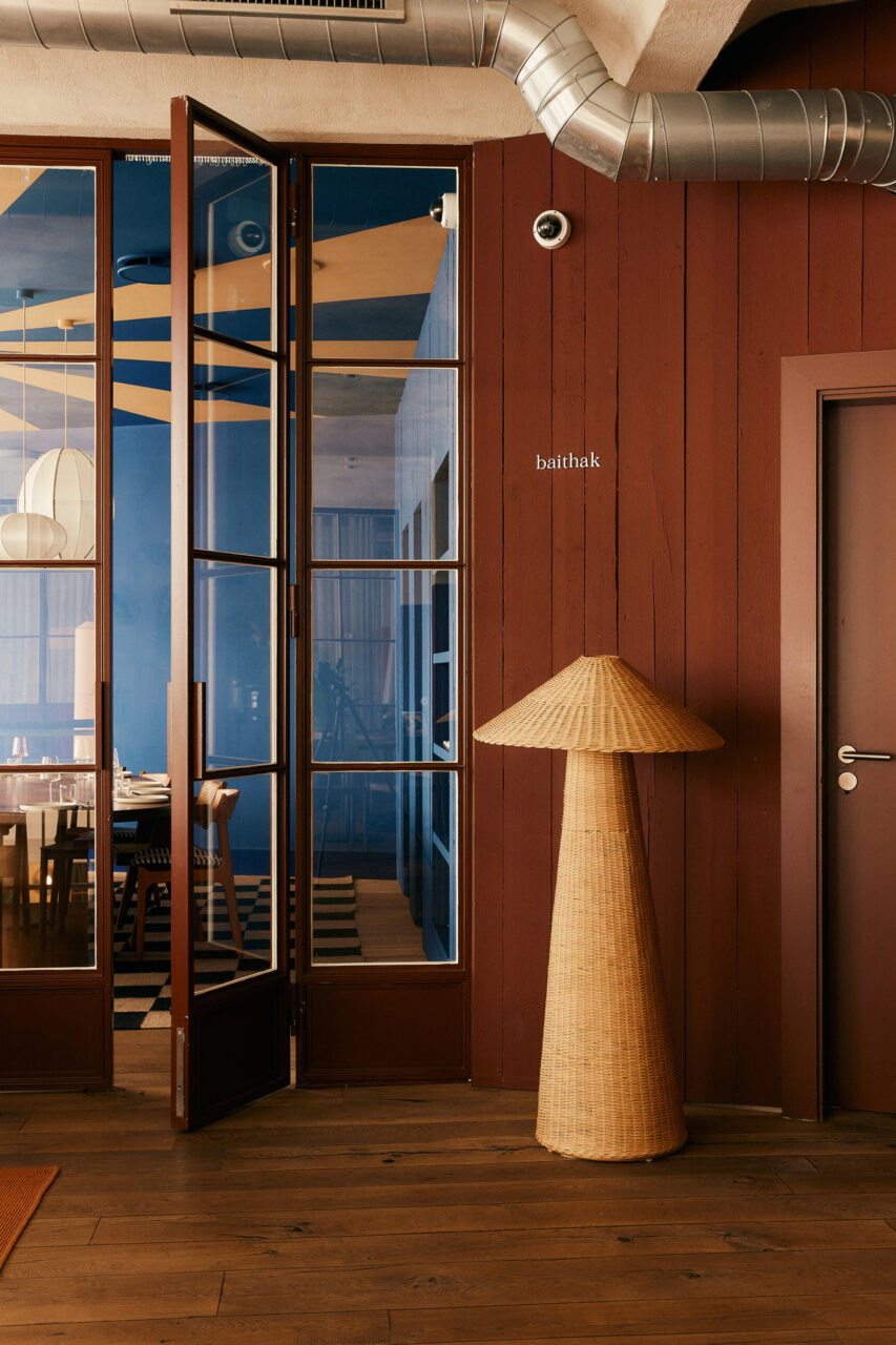
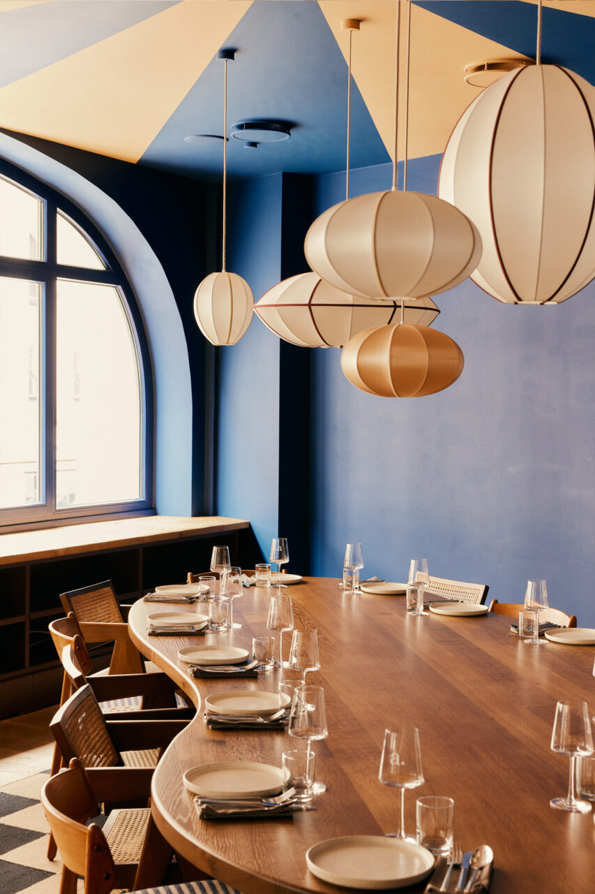
A spacious staircase leads to the upper floor, which was also designed as an evening lounge in the dark colors “Mahogany” and “Makhani”. The “Family Room” offers an intimate retreat for smaller private events. As a festive dining room in the colors “Deep Sea” and ‘Nostalgia’, the room impresses with a 4 meter long, organically shaped “Family Table” and handmade silk lamps, as well as the use of playful patterns and natural materials.
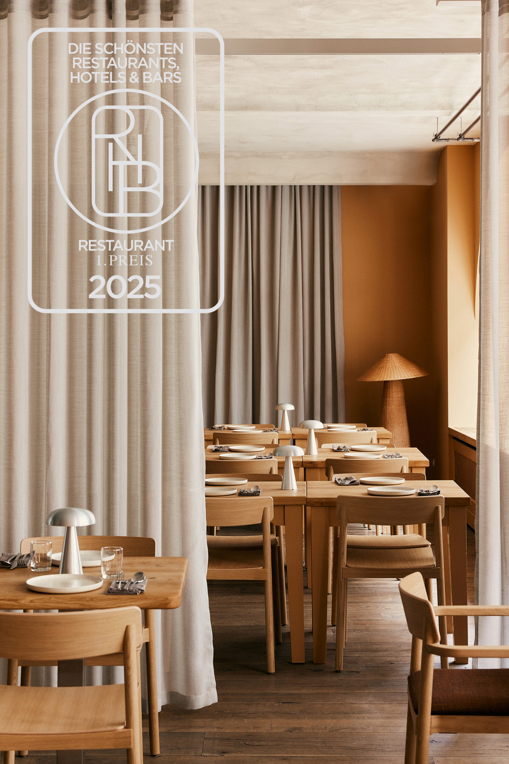
The guest room on the upper floor is used flexibly for both day-to-day business and large events. To allow maximum flexibility in the table arrangement, the room was surrounded by built-in benches and soft flowing fabrics were used as room dividers. This allows the room to be ideally divided and at the same time gives it an elegant, festive character. The main colors are “Tiffin” and “Nostalgia” – a fusion of a cooler shade of grey with a warm ochre tone. The main materials chosen are wood, stainless steel accents, linoleum and natural stone.
Not only is the majority of the furniture handmade, but also the logo, the lovingly designed illustrations, the menu cards, website and staff clothing. The color concept for the restaurant’s branding is inspired by the different colors of India, its typical materials, spices and Indian culture. The typographies reflect the interior mood and are intended to reflect the playfulness and nostalgic character of the restaurant.
Thanks to its central location, Authentikka Mitte is the perfect meeting place – for a business lunch, a chai after shopping or a dinner with friends. The doors are open continuously from early midday until late in the evening, reflecting the values of Authentikka: a place of hospitality and togetherness.


Authetikka Mitte
Hospitality interior architecture
520 qm | Hamburg Mitte | 2024
Conception, Preliminary Planning, Design Planning, Built-in Furniture Design, Furniture Selection, Lighting Selection, Budgeting, Detailed Planning, Tender & Procurement, Artistic Site Supervision
Partner
Kvadrat, Dedar, Camira, &tradition, Modular Lighting, Oi Soi Oi, Ferm Living, Forbo Linoleum, Hübsch Interior, Designers Guild, Nobilis, Flos, Nordic Knots, Santa & Cole, Hay
Photography
Daniel Farò
» The use of strong colors creates characterful spaces that stand out from each other and harmonize with each other in the overall concept. «
With the aim of bringing authentic Indian cuisine to Hamburg, Tarun and Sonja opened the third Authentikka restaurant in Hamburg, nearby the Central Station. The owner couple wanted another restaurant that was modern and at the same time reflected the craftsmanship, nostalgia and traditions of their home country of India – hence the “Modern Indian Nostalgia” concept created by Studio Lineatur.
Spread over 520 square meters on two floors, the new location in the heart of Hamburg offers space for around 200 guests. As in Authentikka in Winterhude, the focus here is on differently designed but harmoniously coordinated concept worlds. A traditional, authentic world with materials that develop a natural patina and another world that appears light, dynamic and lively.
The reception, bar, main dining room and lounge are located on the first floor. The two-storey entrance area, with the spectacular paper lights in the air space and the reception counter made of dark corrugated wood and natural stone, is complemented by a mirror cube, which zones the spacious first floor and reflects the different colors and elements in the room.
The spacious bar is a real eye-catcher with striking striped tiles in the colors “Pappadam” and “Bindi”, a Taj Mahal natural stone top framed in recycled oak wood, as well as rattan arches and a back shelf made of dark corrugated wood. Fresh accents are provided by stainless steel details in the seating area by the windows.
The main dining area in the colors “Okra Green” and “Cardamom”. The back wall is fitted with mirrors, the reflection of which enhances the vibrancy and dissolves spatial boundaries. The covered jute paneling in the profiled wooden frames and the stainless steel wall lights in turn create an exciting interlocking of the concept worlds.
Behind the mirrorcube is a seating lounge where guests can relax and wait for their seat. This includes a curated shelf displaying authentic Indian magazines and books. The mix of tactile elements such as fabric, jute and rattan combined with stainless steel and playful patterns creates a particularly impressive “Modern Indian Nostalgia” look at the transition to the upper floor.
A spacious staircase leads to the upper floor, which was also designed as an evening lounge in the dark colors “Mahogany” and “Makhani”. The “Family Room” offers an intimate retreat for smaller private events. As a festive dining room in the colors “Deep Sea” and ‘Nostalgia’, the room impresses with a 4 meter long, organically shaped “Family Table” and handmade silk lamps, as well as the use of playful patterns and natural materials.
The guest room on the upper floor is used flexibly for both day-to-day business and large events. To allow maximum flexibility in the table arrangement, the room was surrounded by built-in benches and soft flowing fabrics were used as room dividers. This allows the room to be ideally divided and at the same time gives it an elegant, festive character. The main colors are “Tiffin” and “Nostalgia” – a fusion of a cooler shade of grey with a warm ochre tone. The main materials chosen are wood, stainless steel accents, linoleum and natural stone.
Not only is the majority of the furniture handmade, but also the logo, the lovingly designed illustrations, the menu cards, website and staff clothing. The color concept for the restaurant’s branding is inspired by the different colors of India, its typical materials, spices and Indian culture. The typographies reflect the interior mood and are intended to reflect the playfulness and nostalgic character of the restaurant.
Thanks to its central location, Authentikka Mitte is the perfect meeting place – for a business lunch, a chai after shopping or a dinner with friends. The doors are open continuously from early midday until late in the evening, reflecting the values of Authentikka: a place of hospitality and togetherness.




You may also like